1776, a global incubator and venture fund is building a global community. Their goal: To become the hub of news, ideas, events and competitions to help startups succeed.
As 1776 evolved their strategy and growth, their limited visual identity, and disjointed website and competition platforms no longer met their needs. 1776 reached out to Atlantic Media Strategies to help them communicate their new strategies, unify their online platforms, and refresh their visual language.
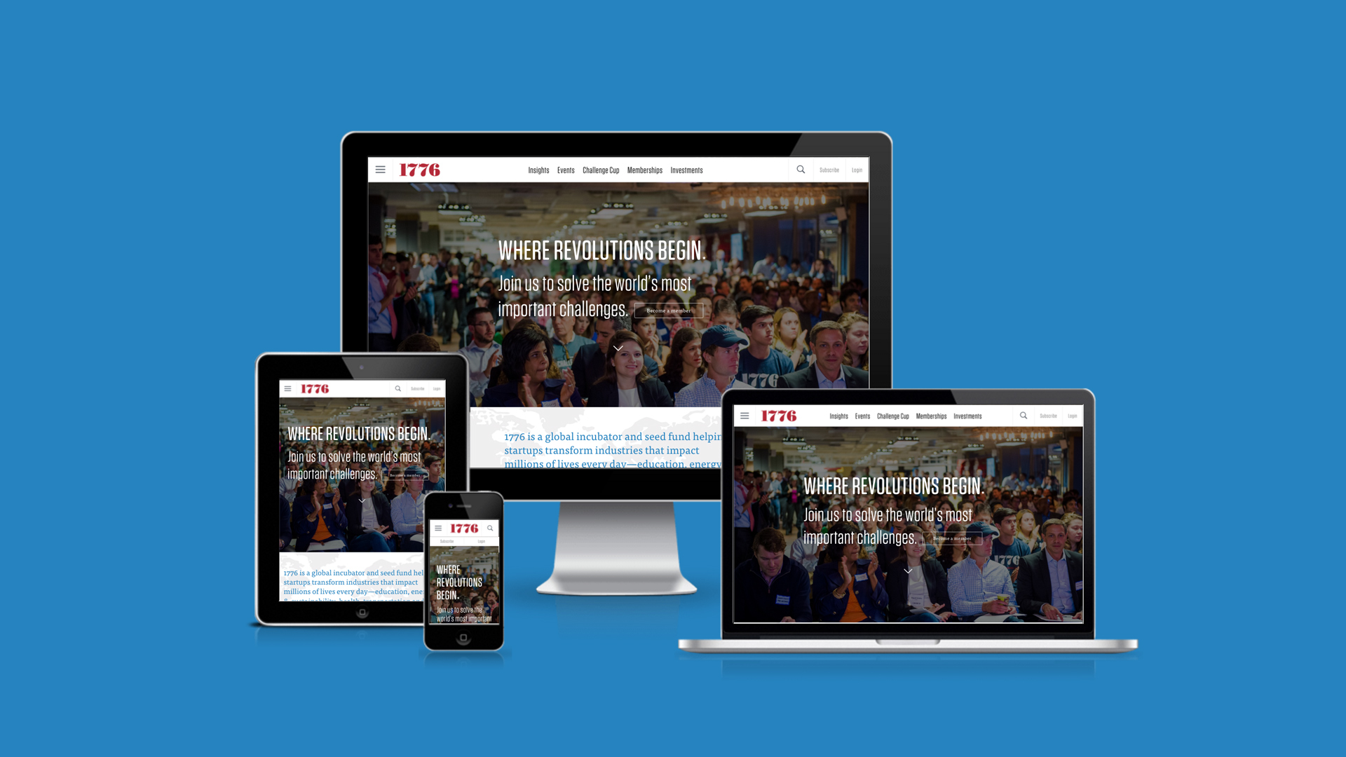
As the lead designer, I designed the user experience and user interface that make it easy for the community of startups, entrepreneurs, and investors to discover, read, share, and sign up for events and competitions. By providing contextual opportunities for users to discover content across insights, events, and competitions at various points of engagement, people can interact with content that matters to them. However, the biggest UX challenge was how to help people find and join the competition in their city or one closest to them, as the competition takes place across 45 cities, through 3 different phases, stretching over 9 months of time. It was a complex problem with varying user needs at different phases of the competition. Despite the short timeline, the site met its goals of clearly communicating the relationship between 1776 and The Challenge Cup, as well as explaining the competition’s process. Overall, I’m most proud of the bold visual language system and online style guide that I created to extend and unify the brand identity of 1776 and The Challenge Cup brands.
Client
1776
My role
Lead product designer at Atlantic Media Strategies
Credit
Leslie Gilliam, Project Manager
Ashley Ballsirzack, Editorial
Nate Luzod & Russell Vea, Development
Recognition
2015 Hermes Creative Award, Gold Award
Element Style Collage
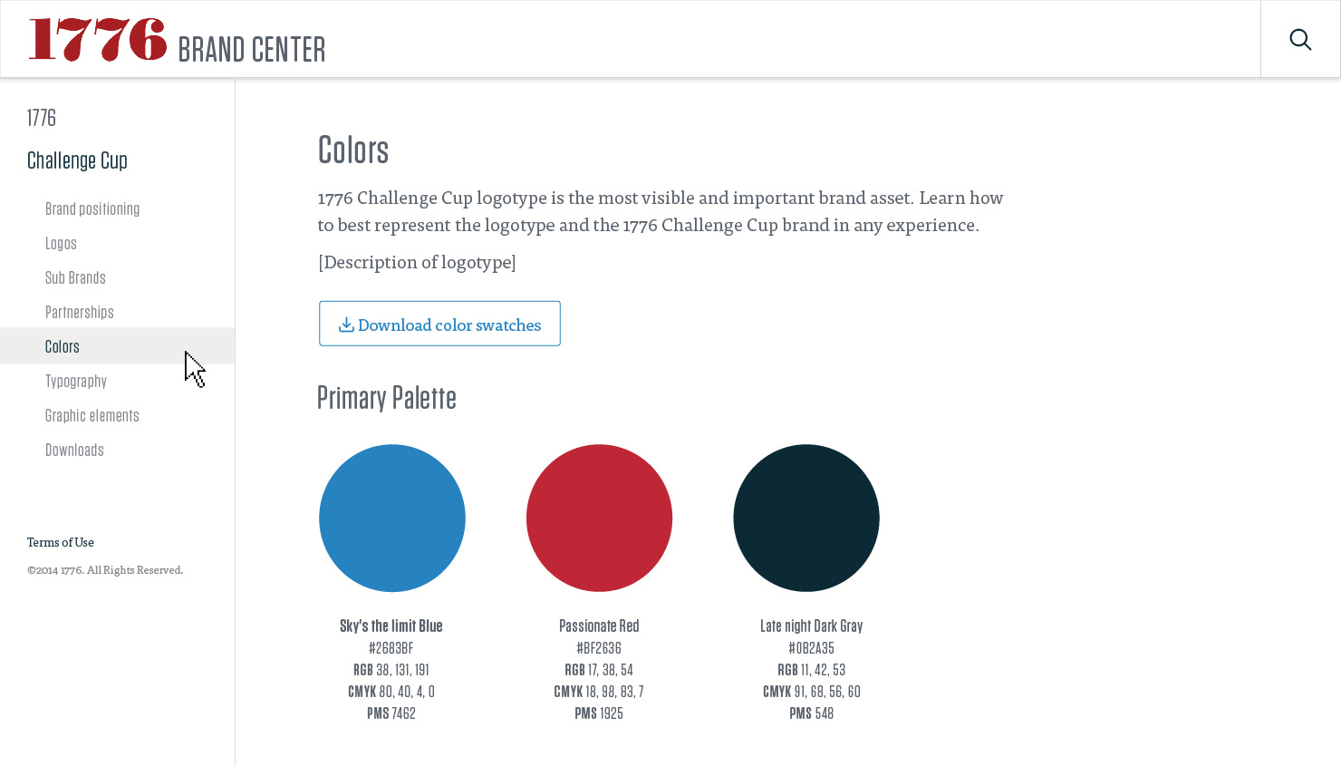
Based on 1776’s existing brand identity, I developed an expanded color palette to reflect their new business strategy and anticipated growth. The brighter, energetic tones convey a cutting-edge, dynamic but thoughtful global community. When used in context, the styles represent a sense of timeliness and urgency.

Leading with a mission
1776’s homepage is a bold statement of their mission.

Insights, Events, and Article reading experiences
To showcase articles and events across all industries, I designed dynamic landing templates to display content in a reverse chronological order. The uncluttered article page was designed for an optimum reading experience. To encourage users to discover new content as they reach the end of the article, the page unfolds with the discovery module of related articles, events and competitions based on the same topics.

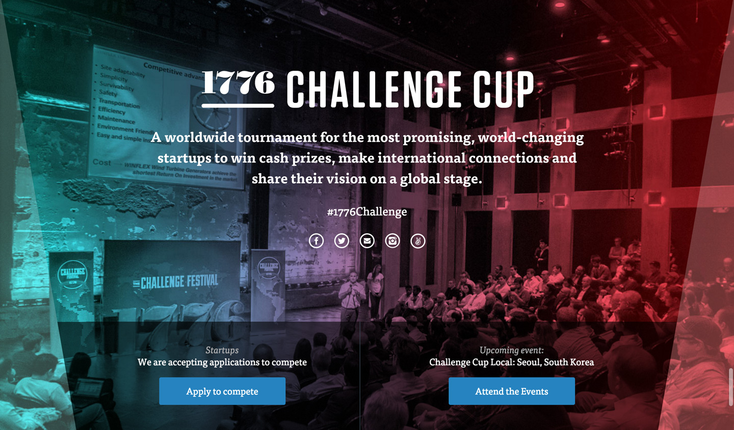
Refreshing The 1776 Challenge Cup brand identity
This design unveils the new 1776 Challenge Cup logo and visual language, with flexibility and versatility to support The Challenge Cup as it grows and expand its global reach.
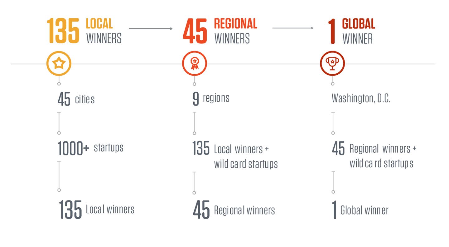
Iconography & Infographic
The worldwide tournament takes place in the span of nine months, in 45 cities across the world. I designed an infographic to visually communicate and help people better understand The 1776 Challenge Cup process. Colors are used to define each phase of the competition.
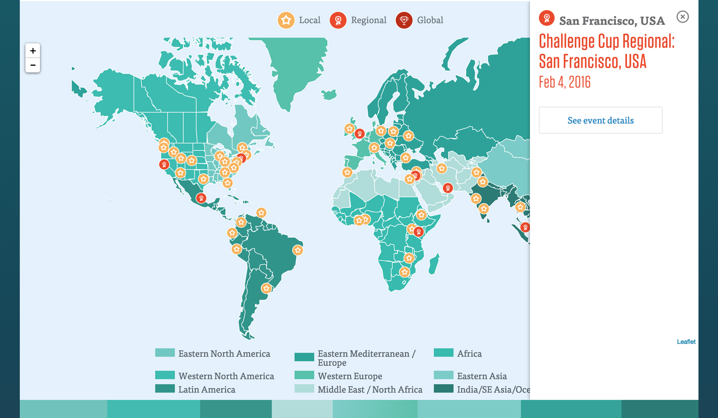
Interactive map
The Local and Regional competition phases overlap and often caused confusion depending which on cities your startup is located. To help solve this problem, I designed an interactive map that shows all the competition events taking place between October and June worldwide. I used icons and colors to communicate the different competition phases in order to help people make quick association and meaning.
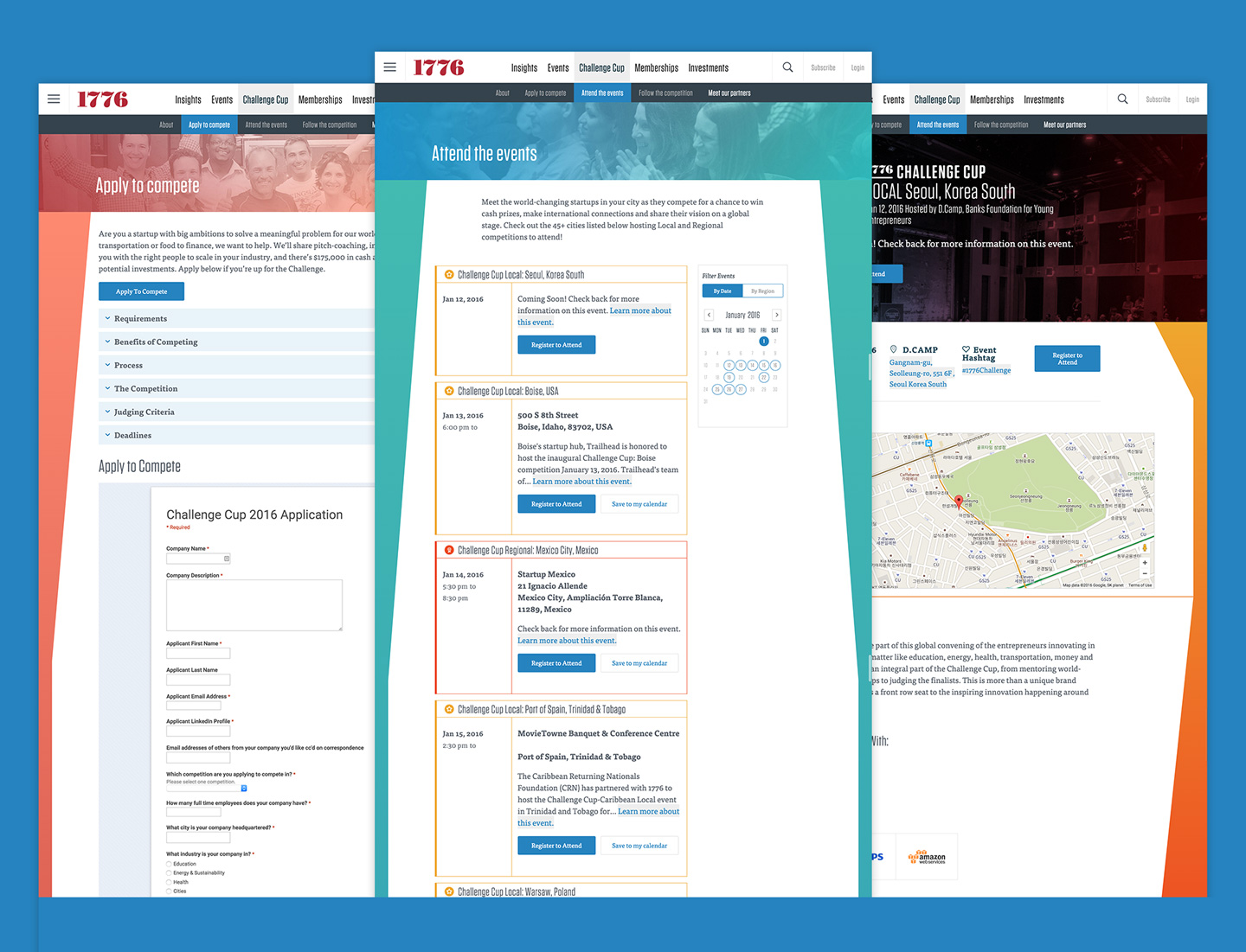
Apply to compete, Attend the events, and Competition Event page
Juxtaposing the competition phase colors are a set of cool background gradients for the interior pages. With each competition phase, startups go through a funnel from which emerges one global winner. Inspired by the funnel concept, I designed the background to mimic the abstract cup shape. Since these pages contain a large amount of information, the background designs are intended to encourage scrolling.
Follow the competition Icons
Iconography communicating the process and timeline of the competition.
Follow the competition pages
Each competition phase is colored coded with a recognizable icon, intended to help users distinguish each phase. The icons at the top of the page are linkable to their landing pages where users can learn about the competing startups, news from the events, and ultimately the winners from that phase.

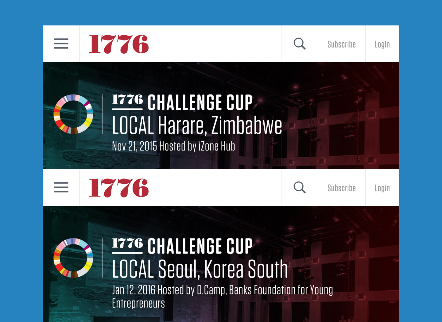
Branding a system
Individual competition event page can be created and edited by the event host. The competition branding for each city was built into the system so that when the host enters competition details, the brand identity is dynamically created to keep a consistent look and feel. This feature was designed to minimize extra work for the 1776 Challenge Cup staff as they head into the competition season.
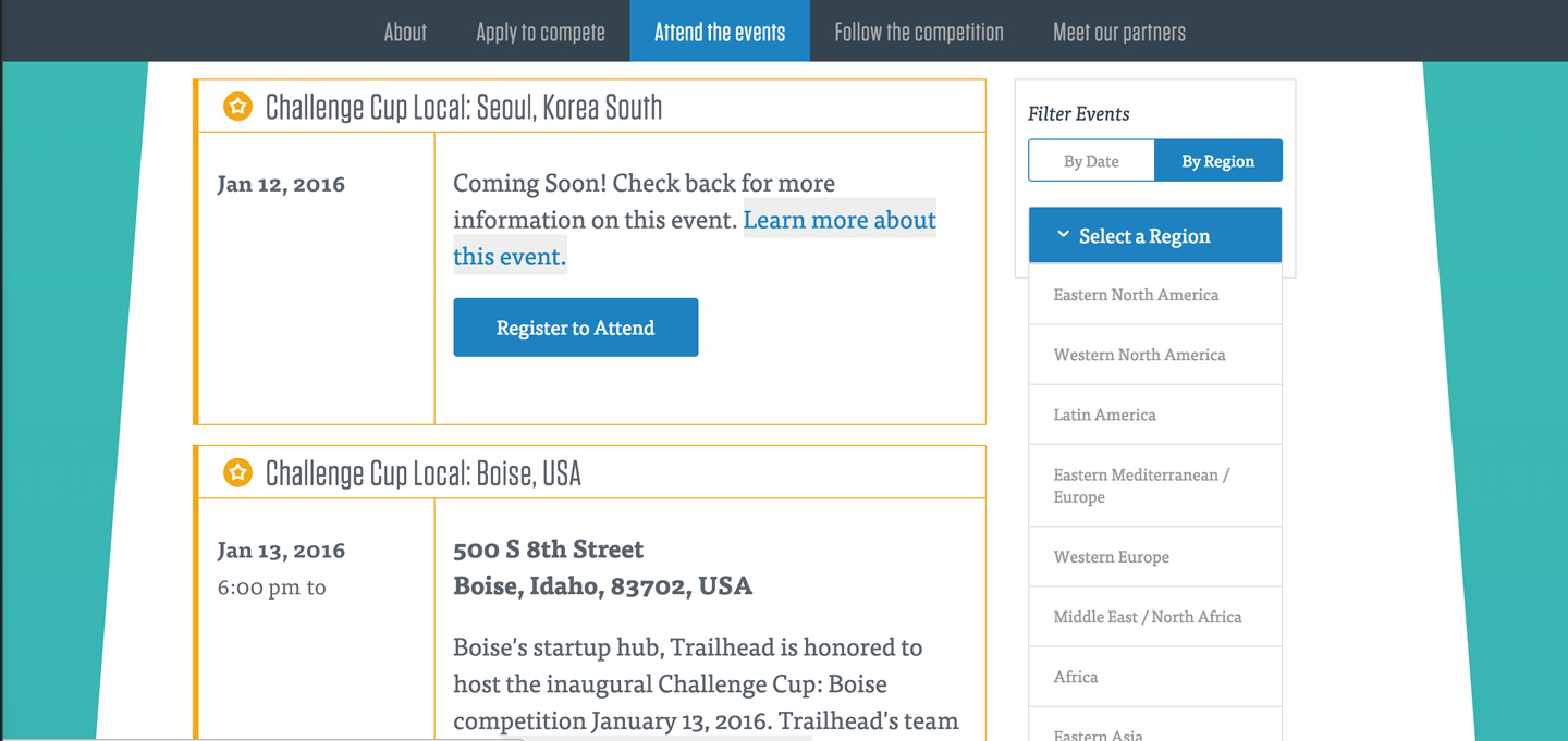
Filtering features for competition events
All competition events are filterable by date or by region. The results are outlined by the color of each competition phase.
The 1776 brand center
The brand center is an online style guide tool to help the team and their event hosts keep a consistent look and feel as they grow.